is a Senior Art Director and Type Designer based in Stockholm, with studio experience across Sweden, Portugal and the US. His practice sits at the intersection of brand identity and custom typography, where letters become the foundation of visual systems. With award-recognised work spanning branding and type design, Bruno is freelance and open to collaborating with agencies and studios looking for a senior creative to work with.
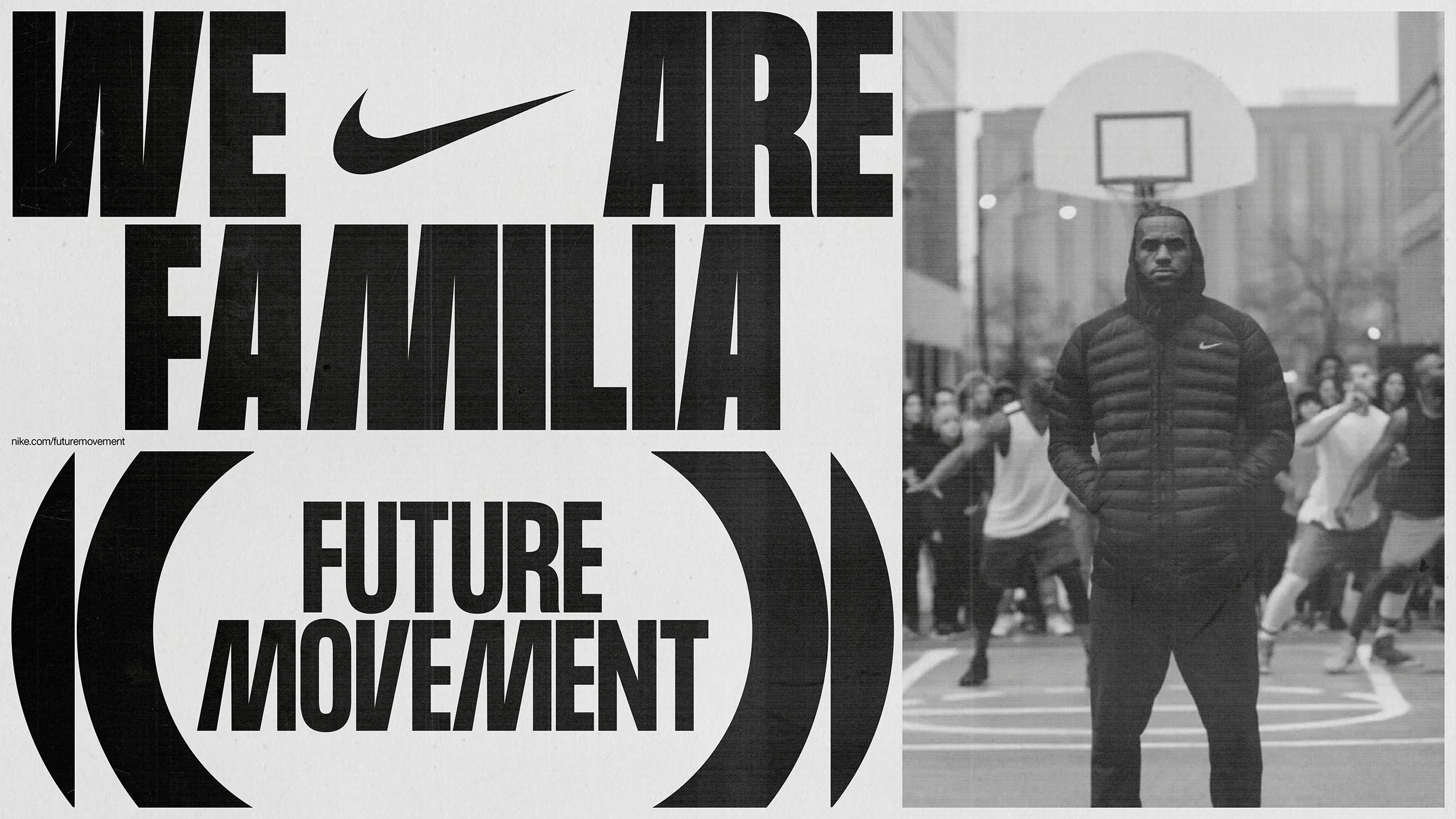
Nike – Future Movement Branding & Custom Typeface

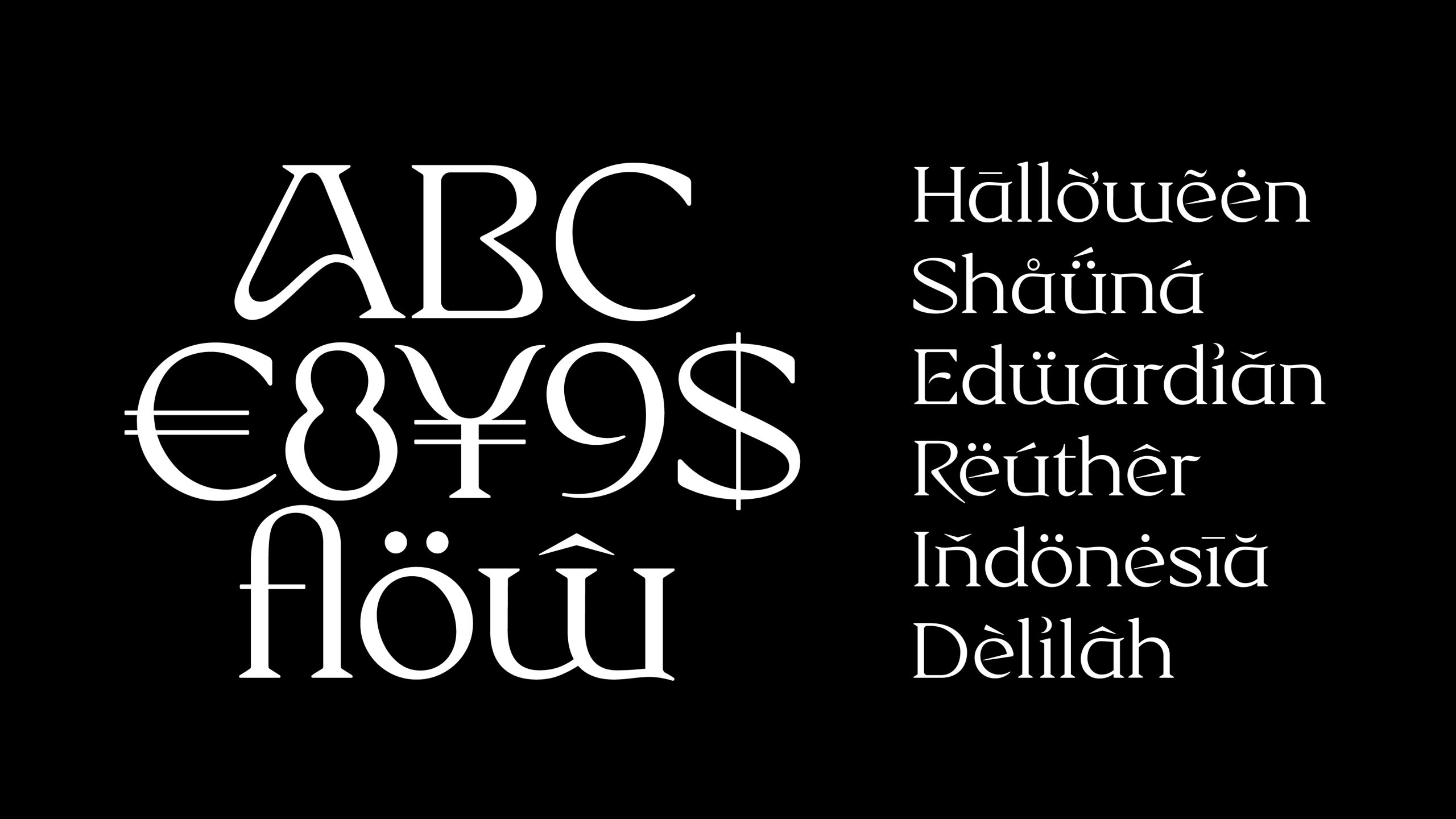
Gravity Breath Custom Type

Entardecer Poster Design

GZ Branding


Epithalamium Cover / Editorial Design / Type Design
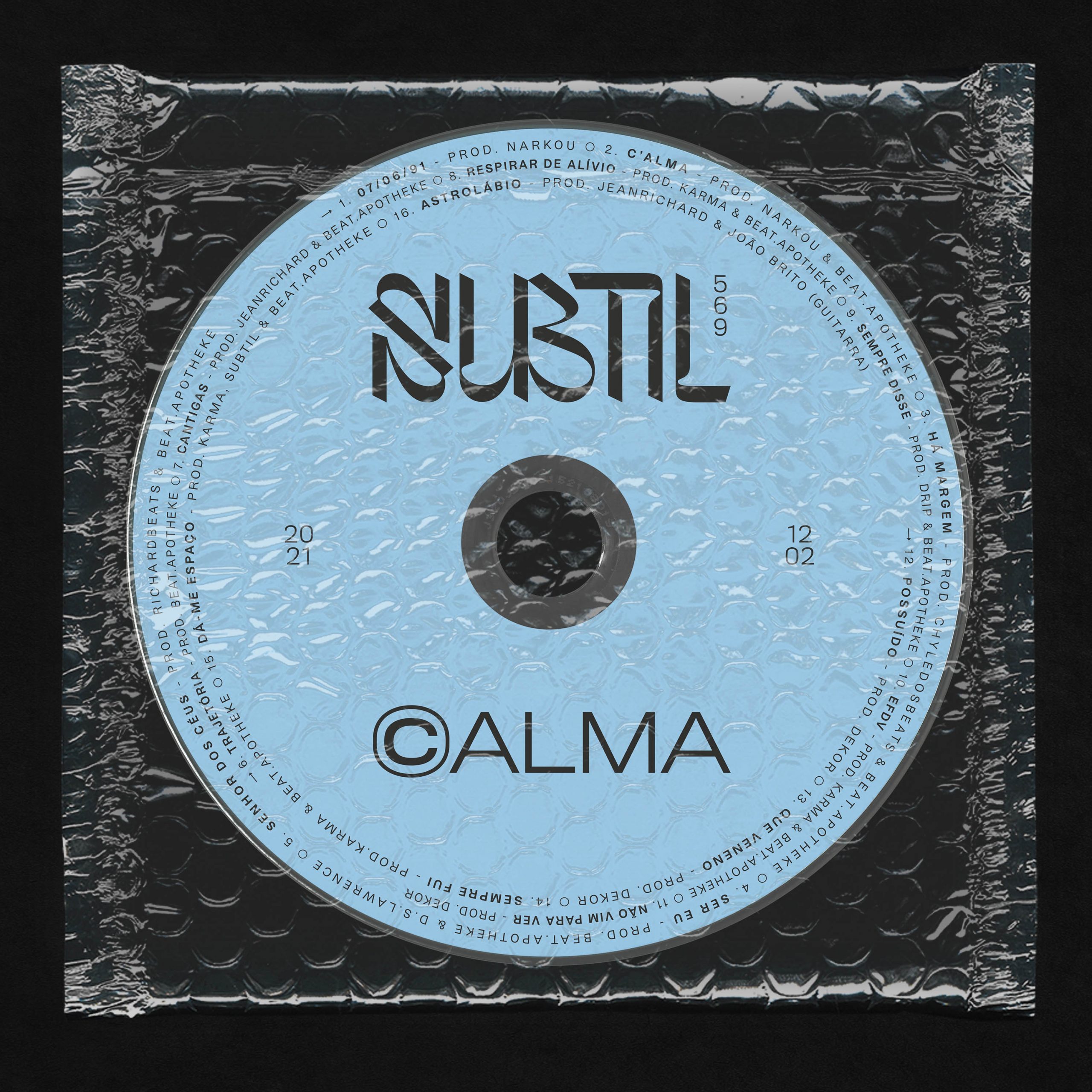


Subtil C'ALMA Branding / Album Cover / Type Design

Quando Mil Milhoes de Chineses Saltam Cover / Editorial Design

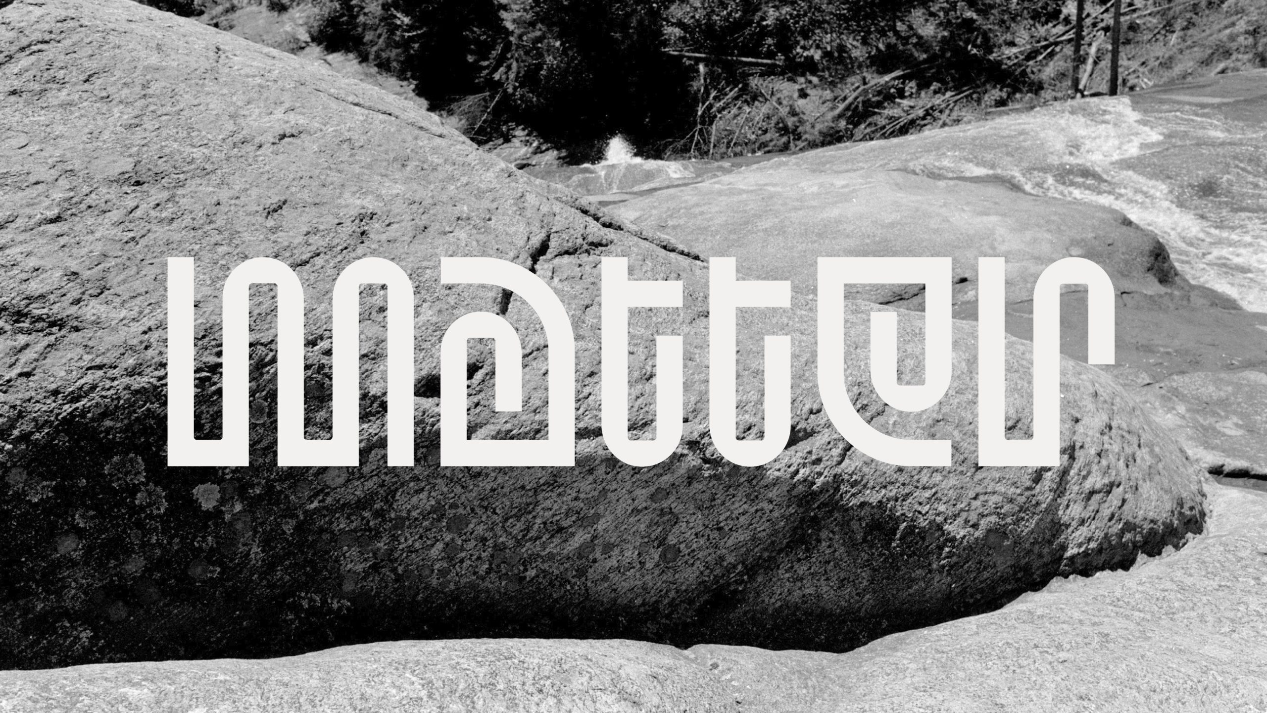
Contrivance #4 Poster / Type Design

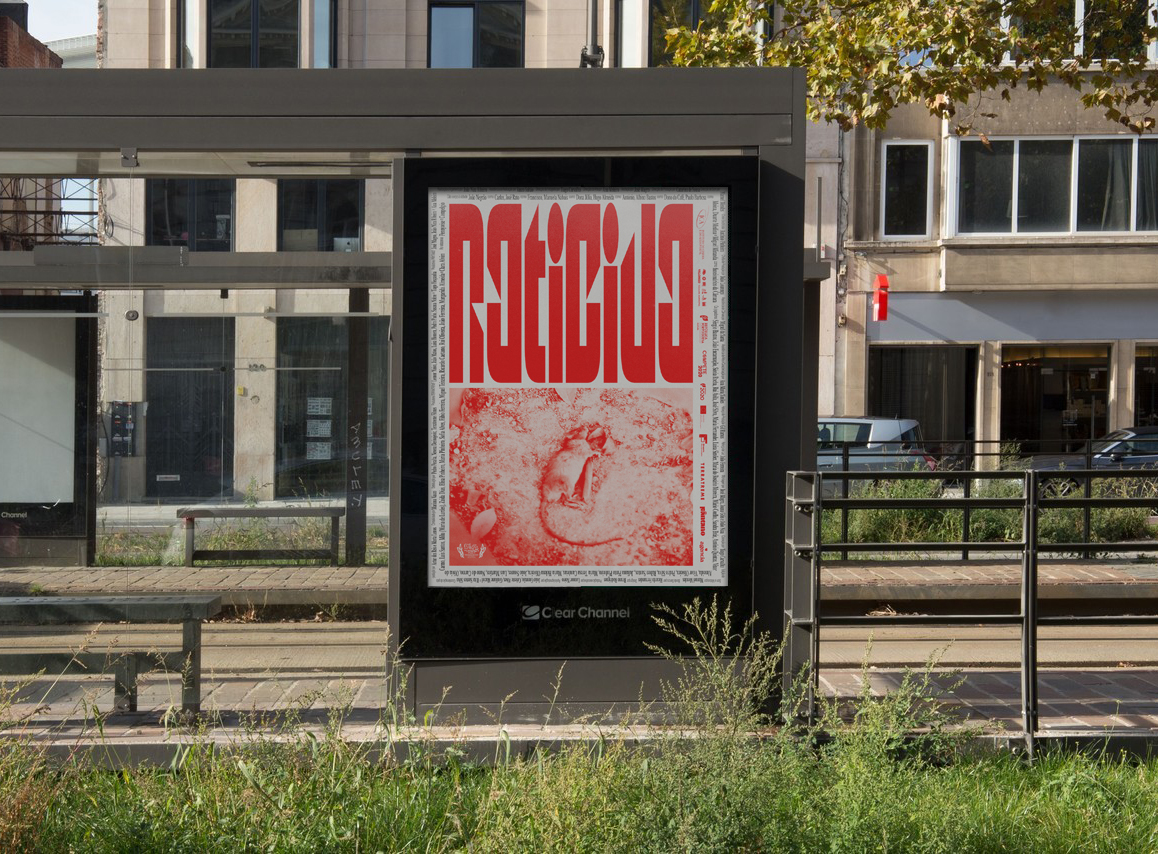
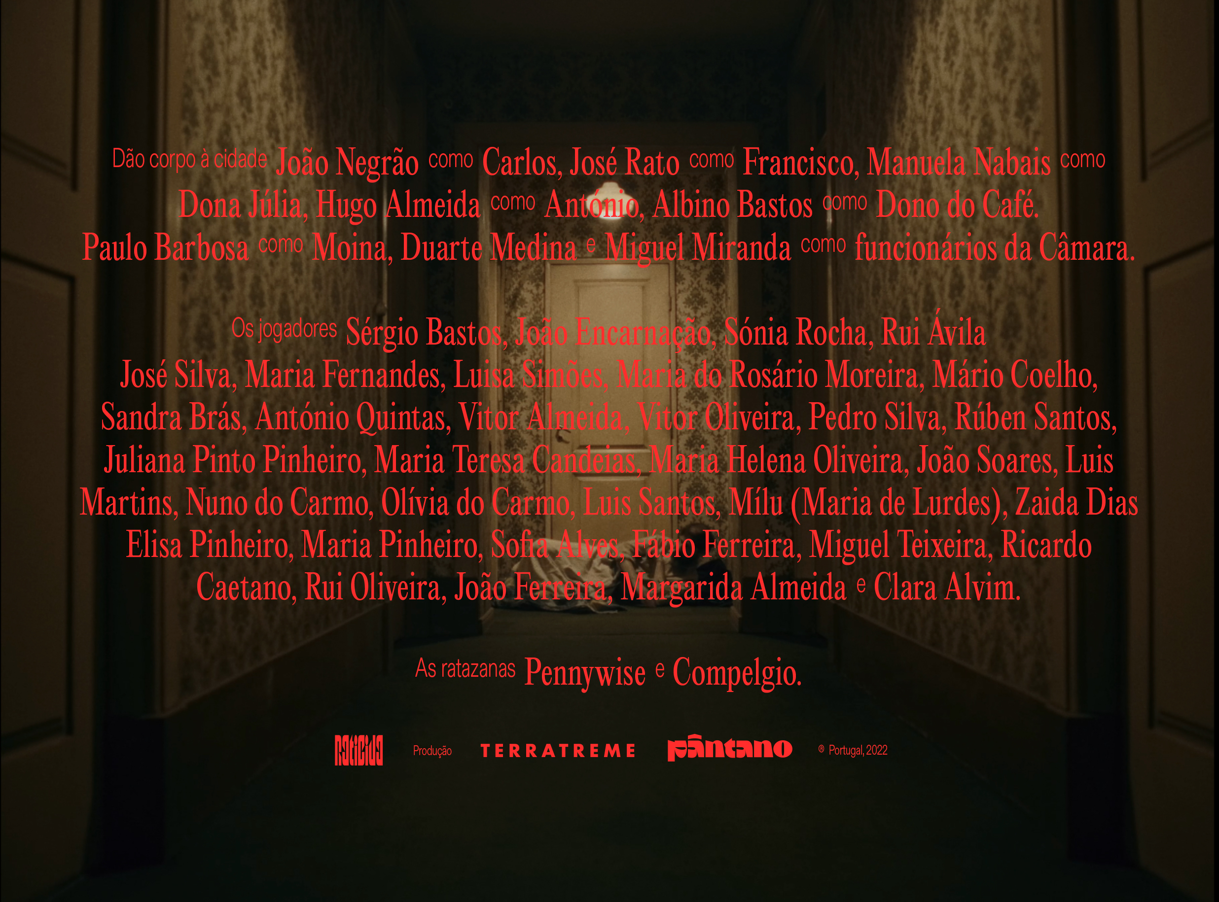
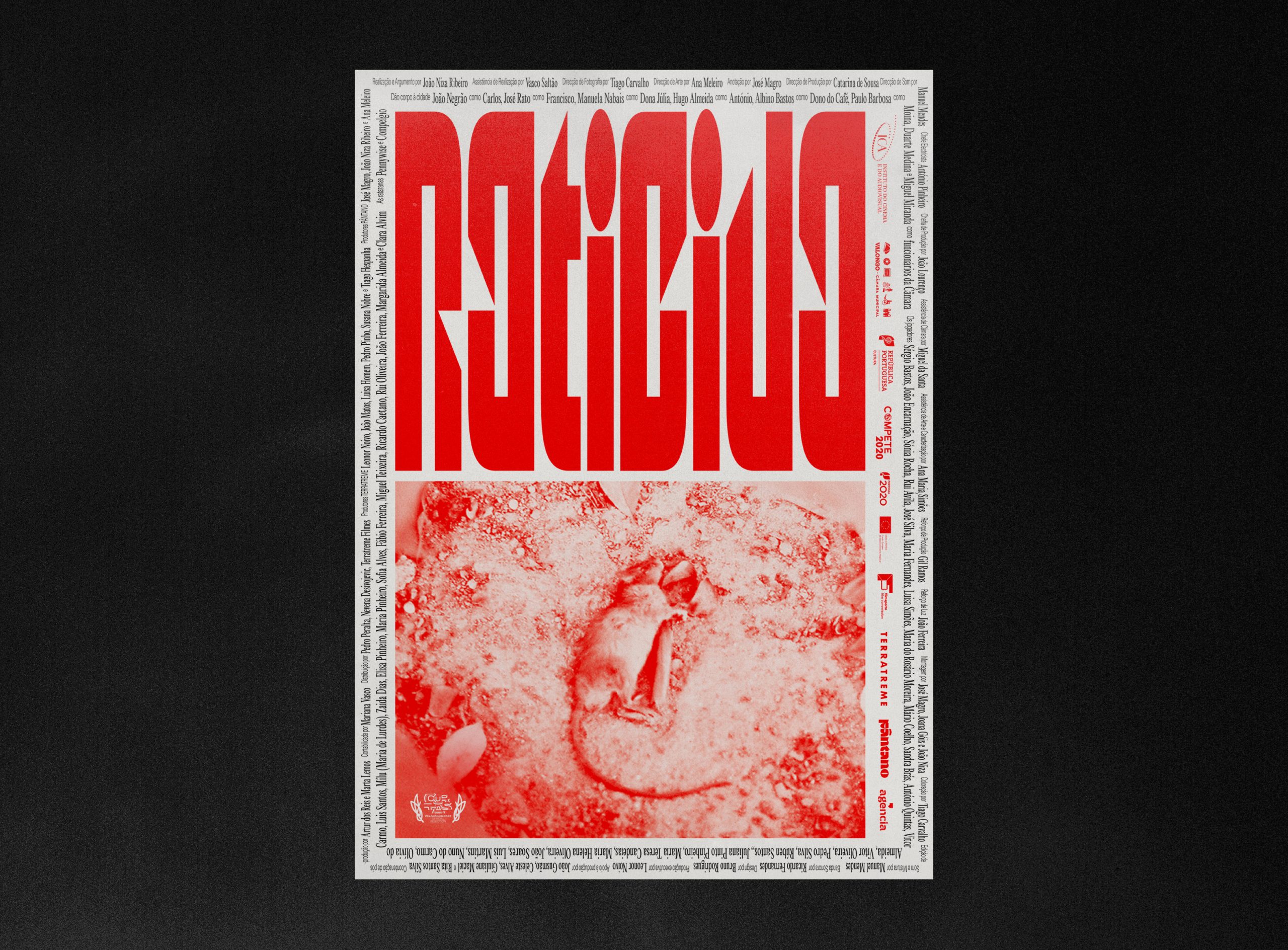
Raticida Film Sequence / Poster Design
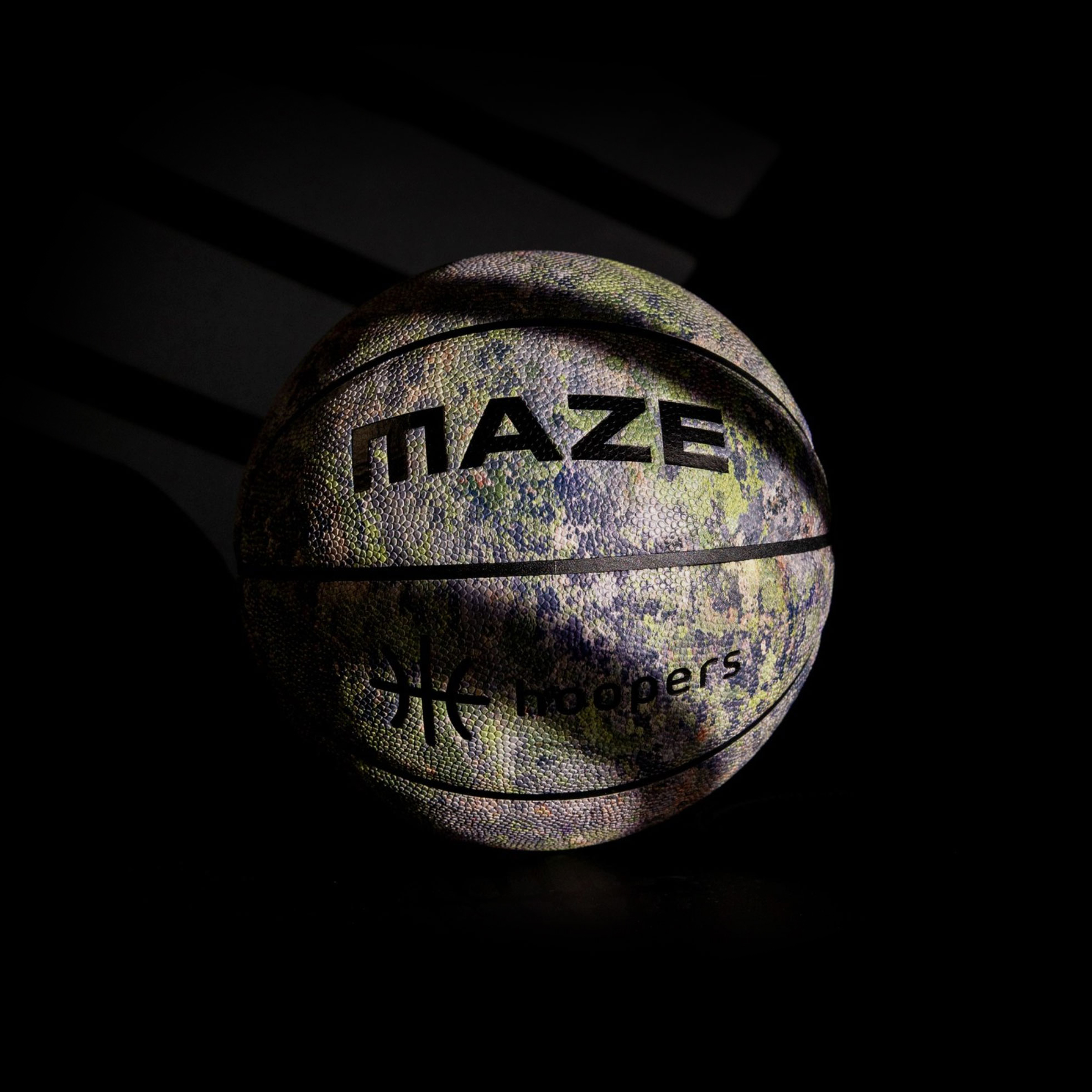
The Rock – MAZE Basketball / Product

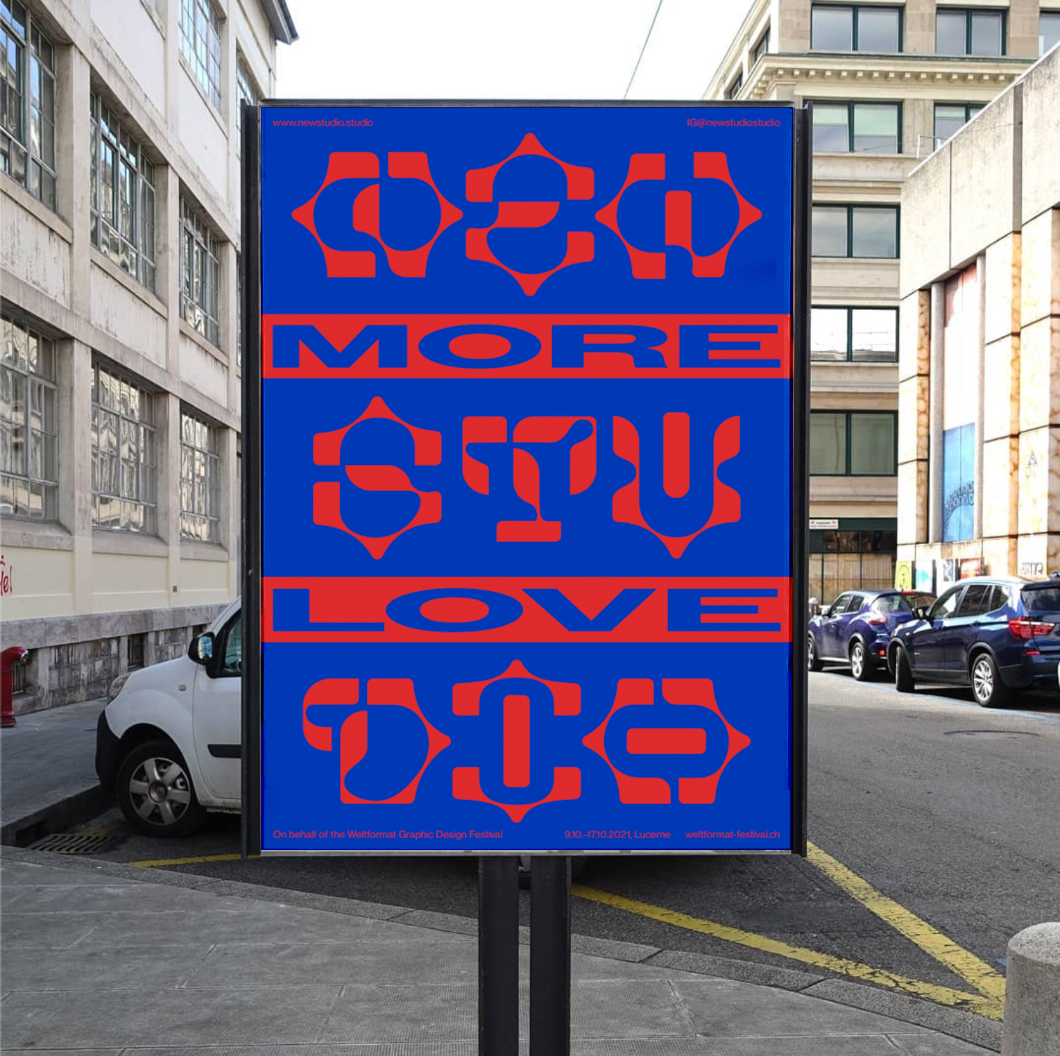

More Love Poster/ Type Design

Erro Crasso Poster Design


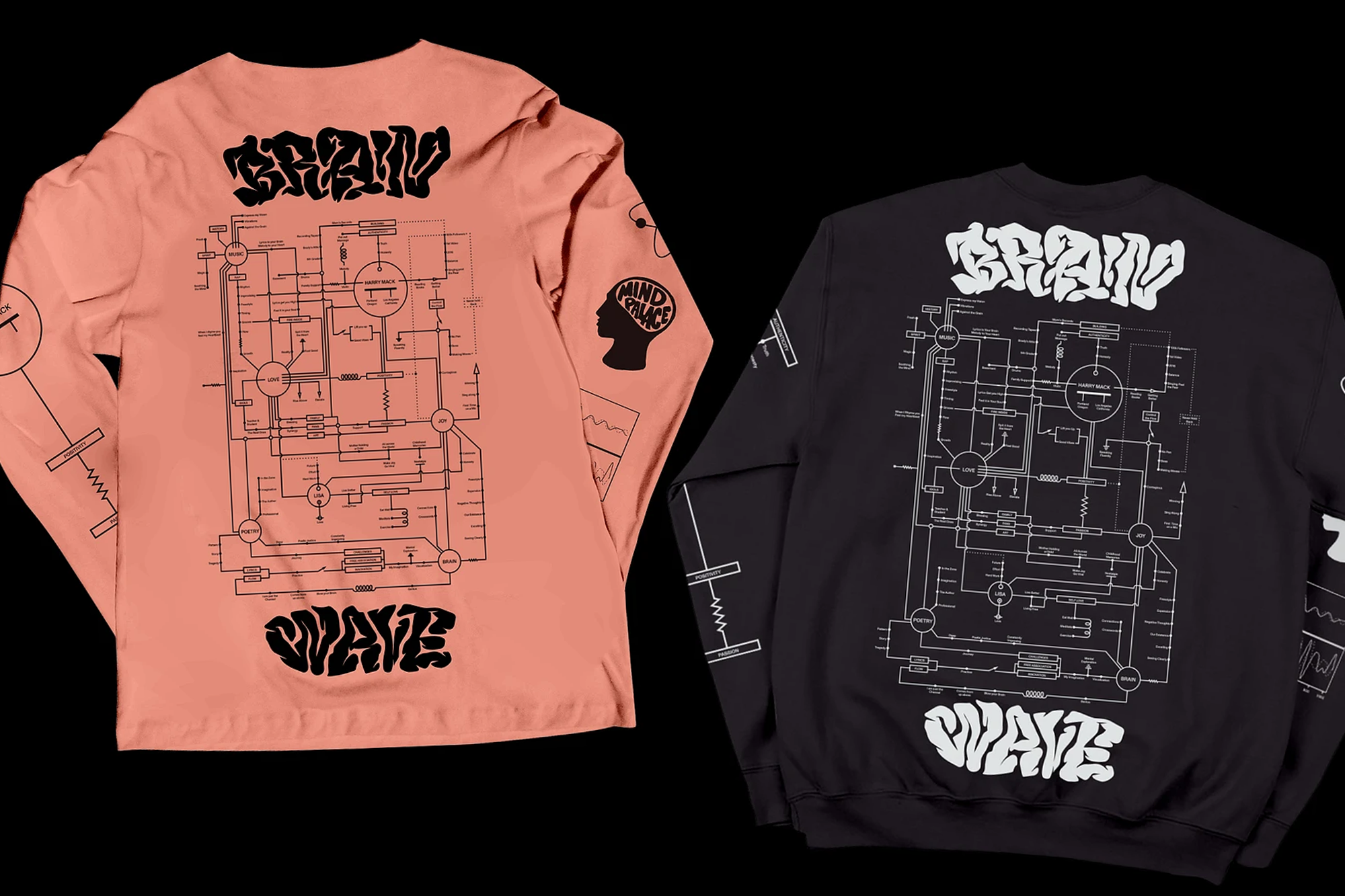


Brain Wave – Harry Mack Type Design

A Brand Designer and Art Director focused on graphic and type design, currently based in Stockholm. His work exists at the intersection of branding and custom typography, treating letterforms as raw material for visual systems.
Specialised in branding with a broad approach to design practice, his experience spans identity, packaging, editorial and type design across studios in Portugal, Sweden and the US. This range of disciplines shapes a versatile practice, one that welcomes different kinds of challenges and finds the right creative angle for each brief.
Featured in Slanted Magazine and awarded by Art Directors Club of Europe, European Design Awards, and CCP, his work is driven by a consistent focus on craft and typographic detail.
