Menu
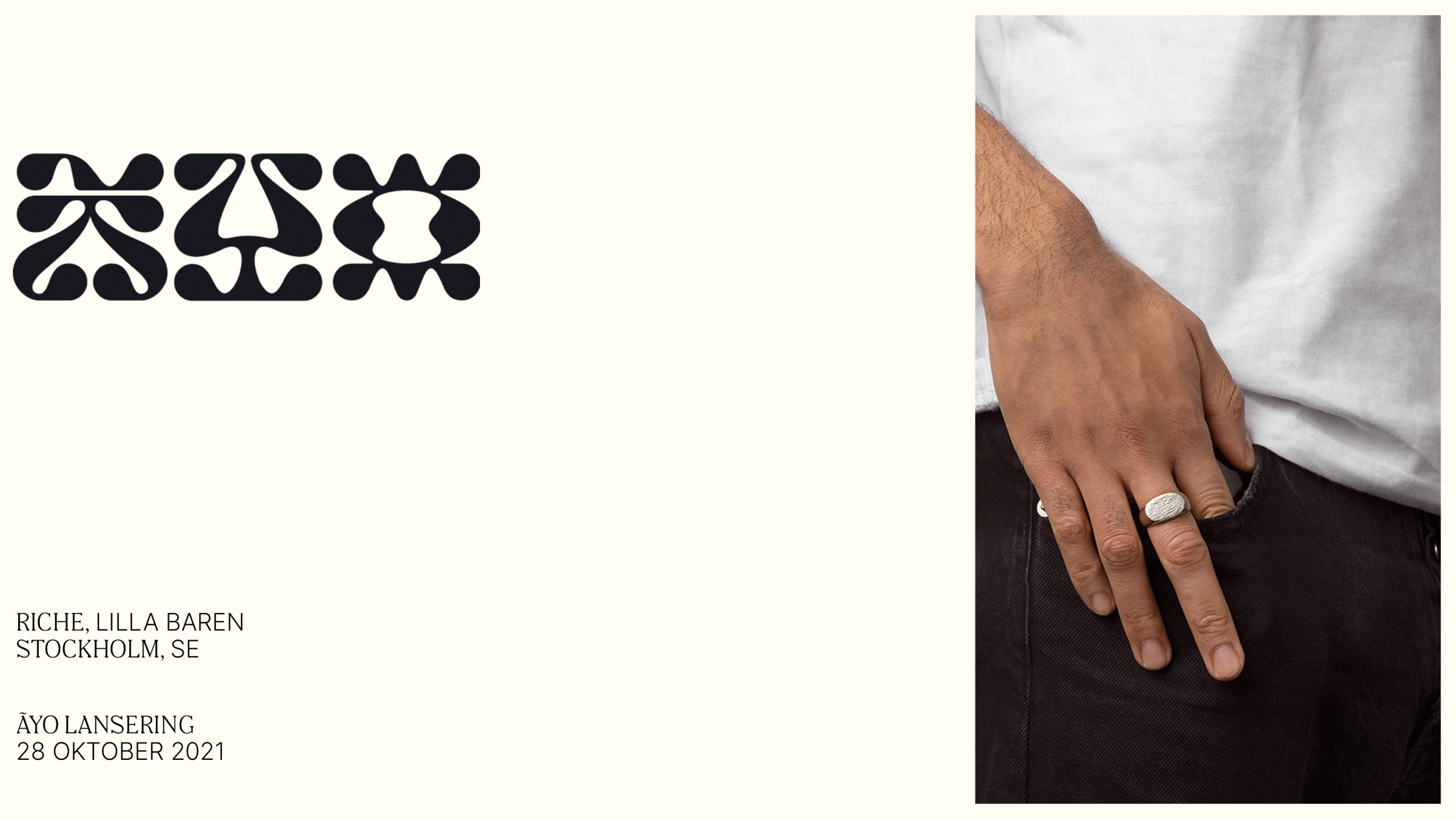
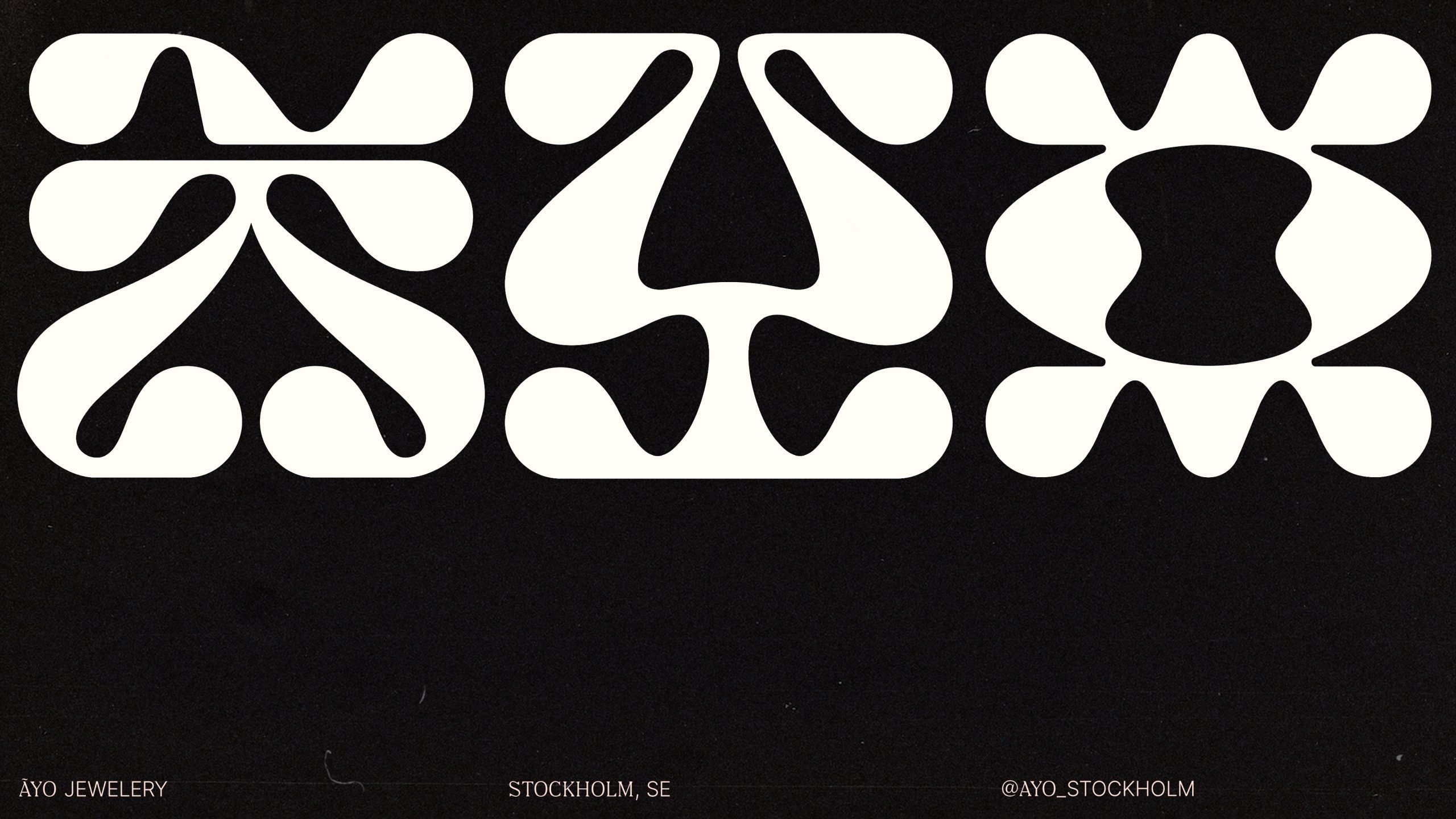
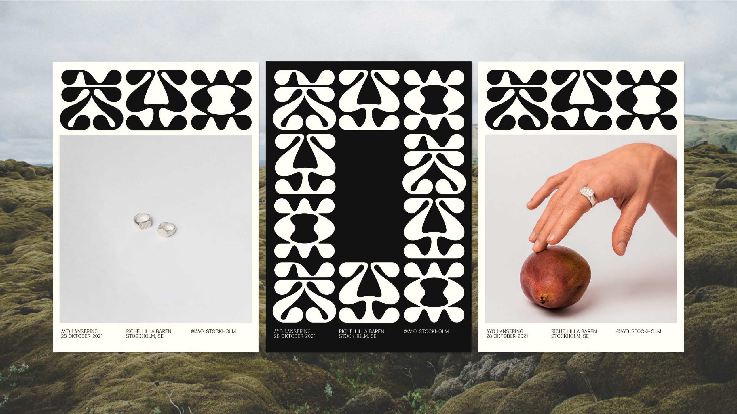
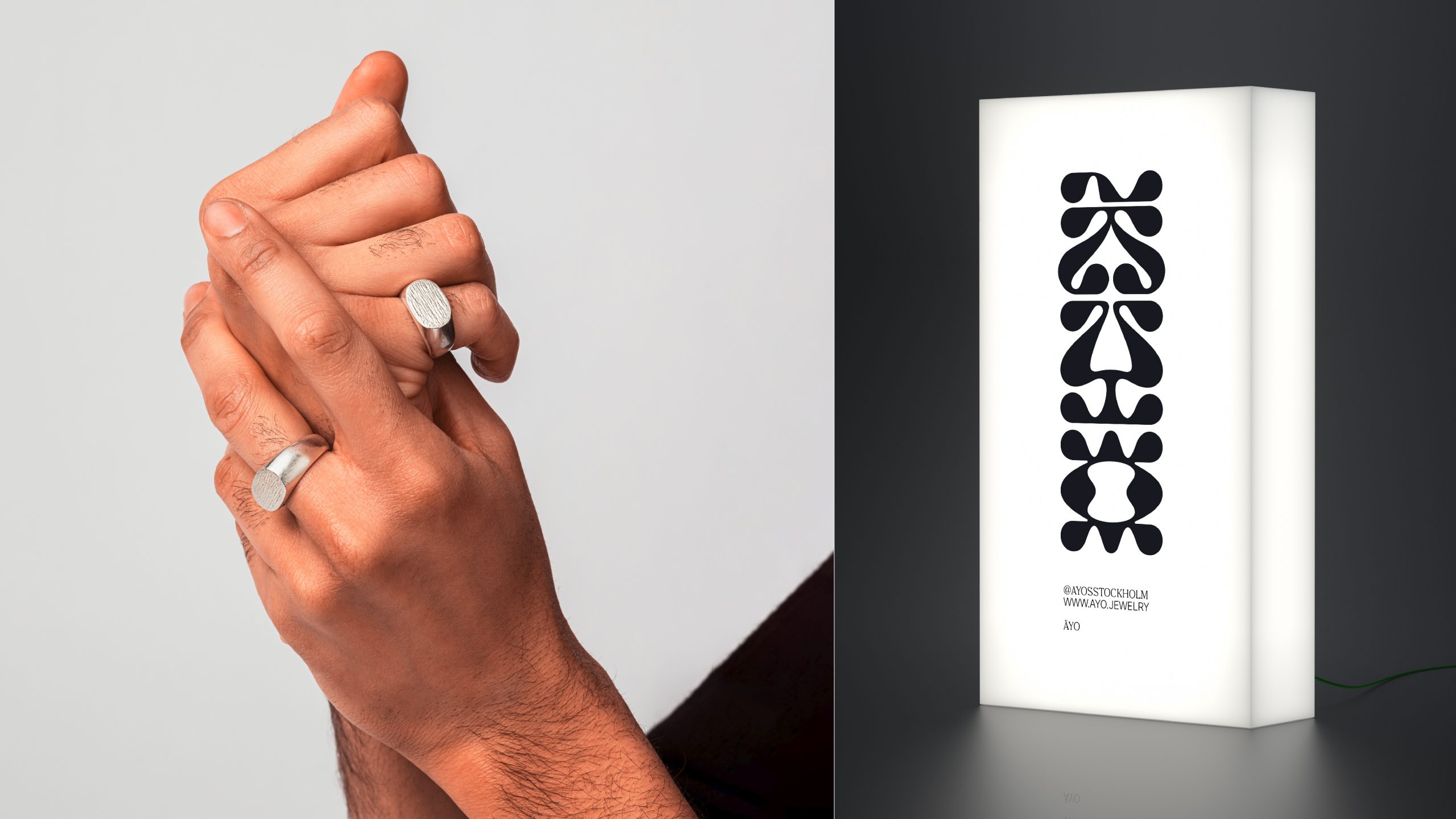
ÃYO
Art Direction / Branding
From the Nigerian, “Ãyo” has a positive message as “Joy”. That heritage was the central inspiration source for this wordmark graphic exploration. The tribal visuals bring harmony and a solid presence to its drawing. There was an aim of inducing curiosity on the first experience with the brand, but creating some connection with it and interaction of its meaning was a strong point for this approach.
This project was developed for a jewelry brand from Stockholm to create a tight and memorable graphic appeal, using the name ÃYO to explore the potential of the letter shapes, using its mirrored geometry and the tilde that belongs to the origin of the word. A sort of minimalistic brand utilizing tensions within the logotype and the typographic layouts to create dynamism within each brand touchpoint.
Project developed in collab with William Larsson.