Menu
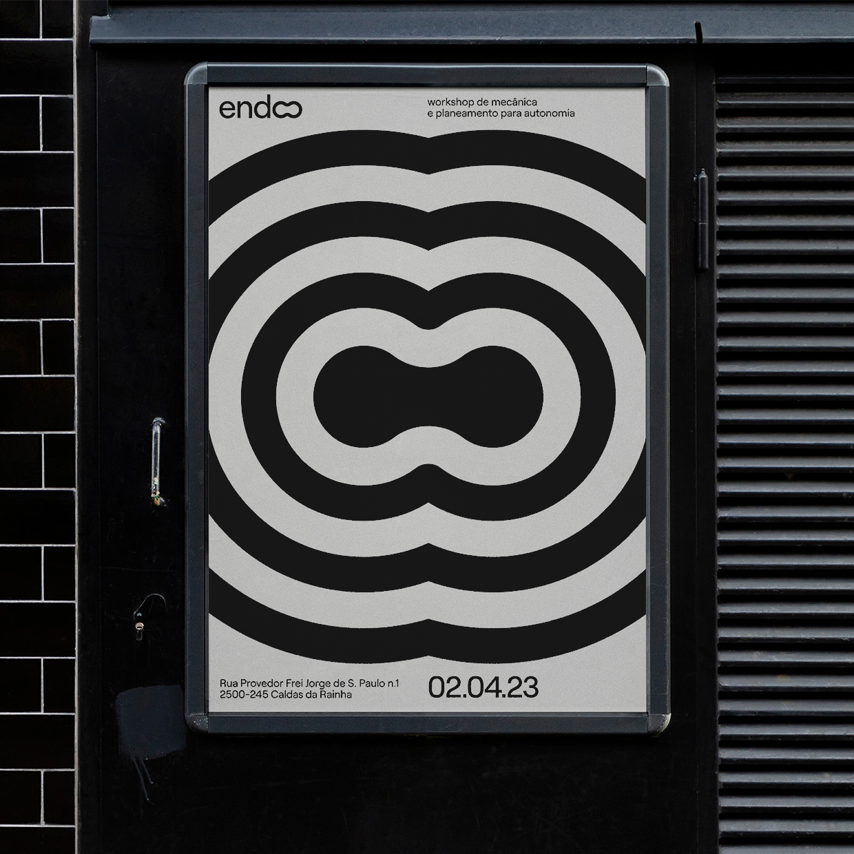
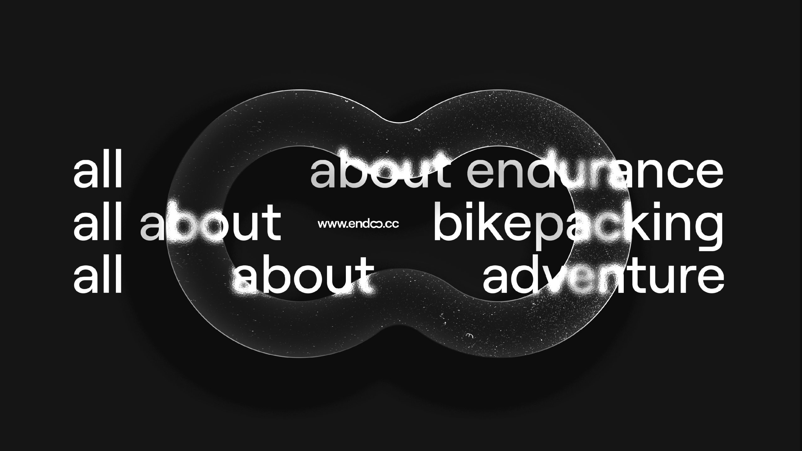
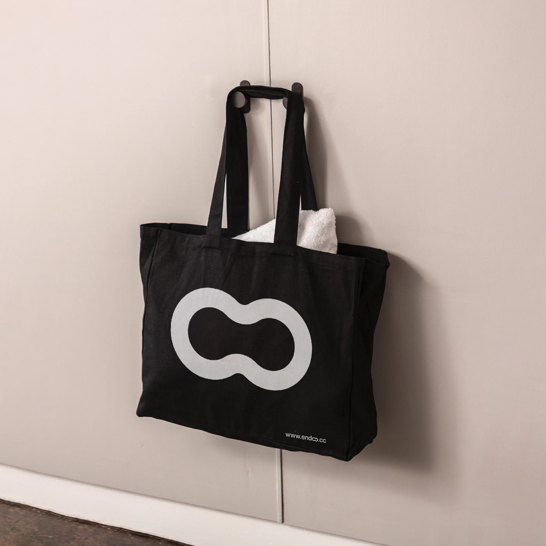
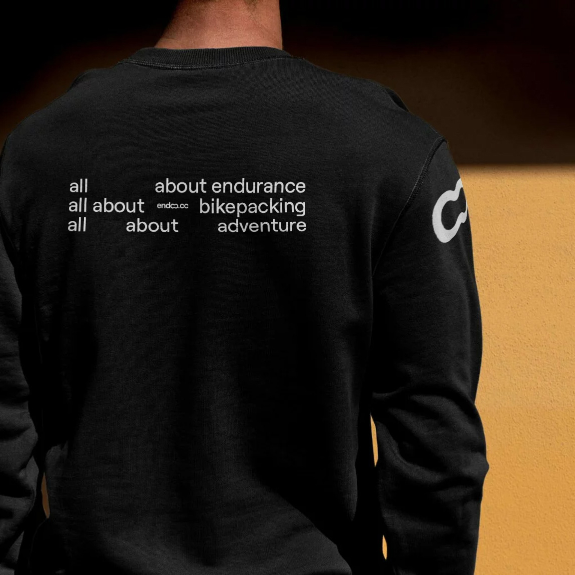
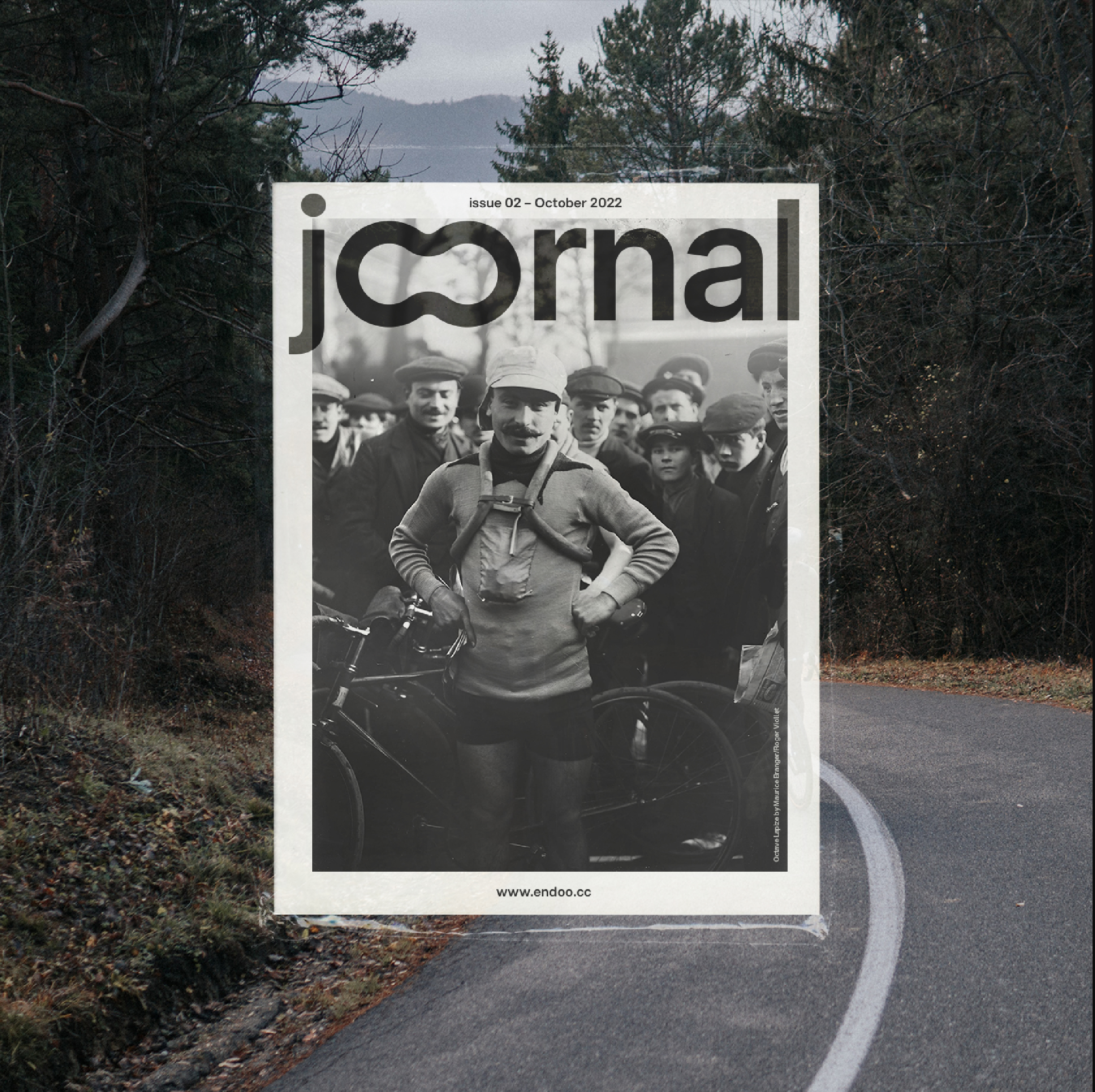
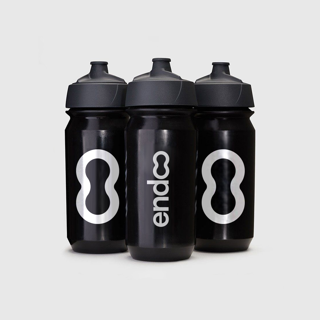
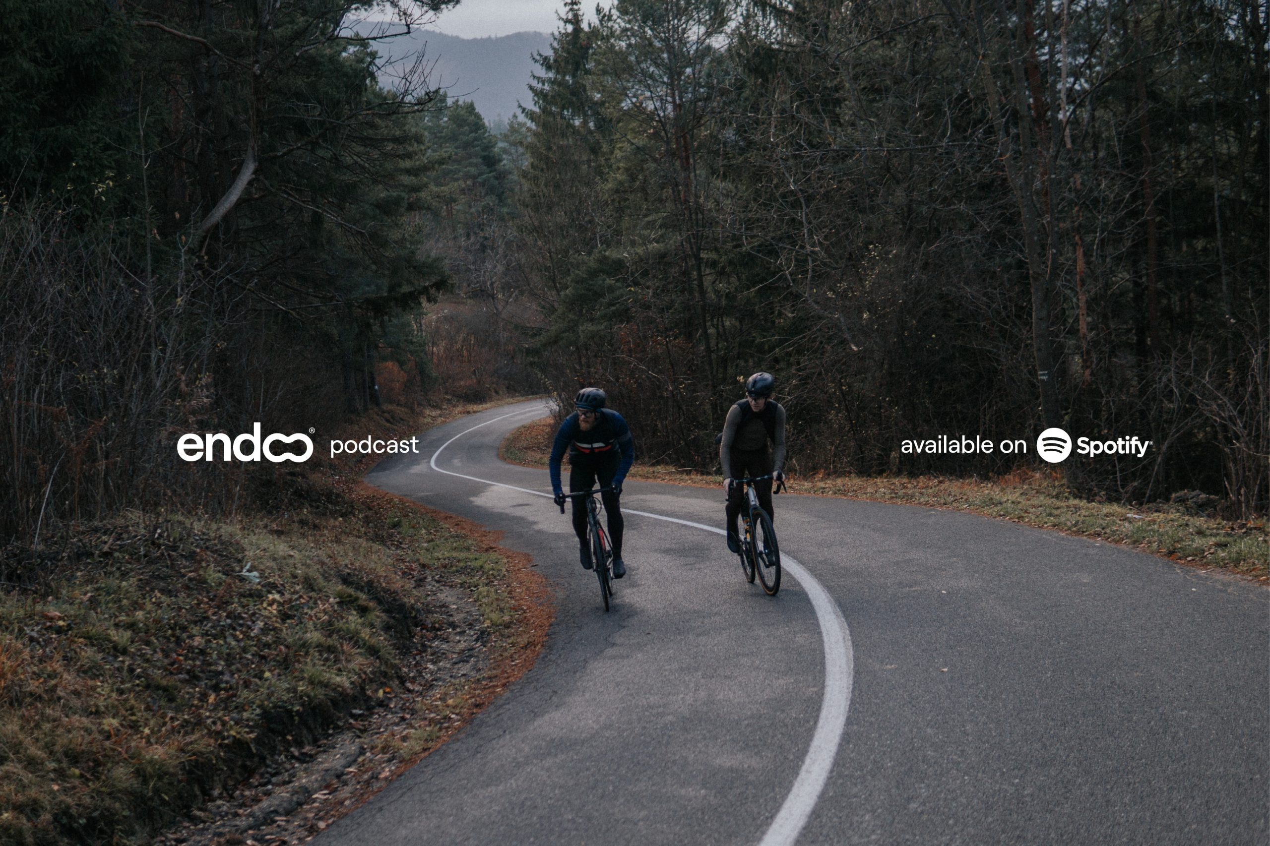
endoo
Art Direction / Branding
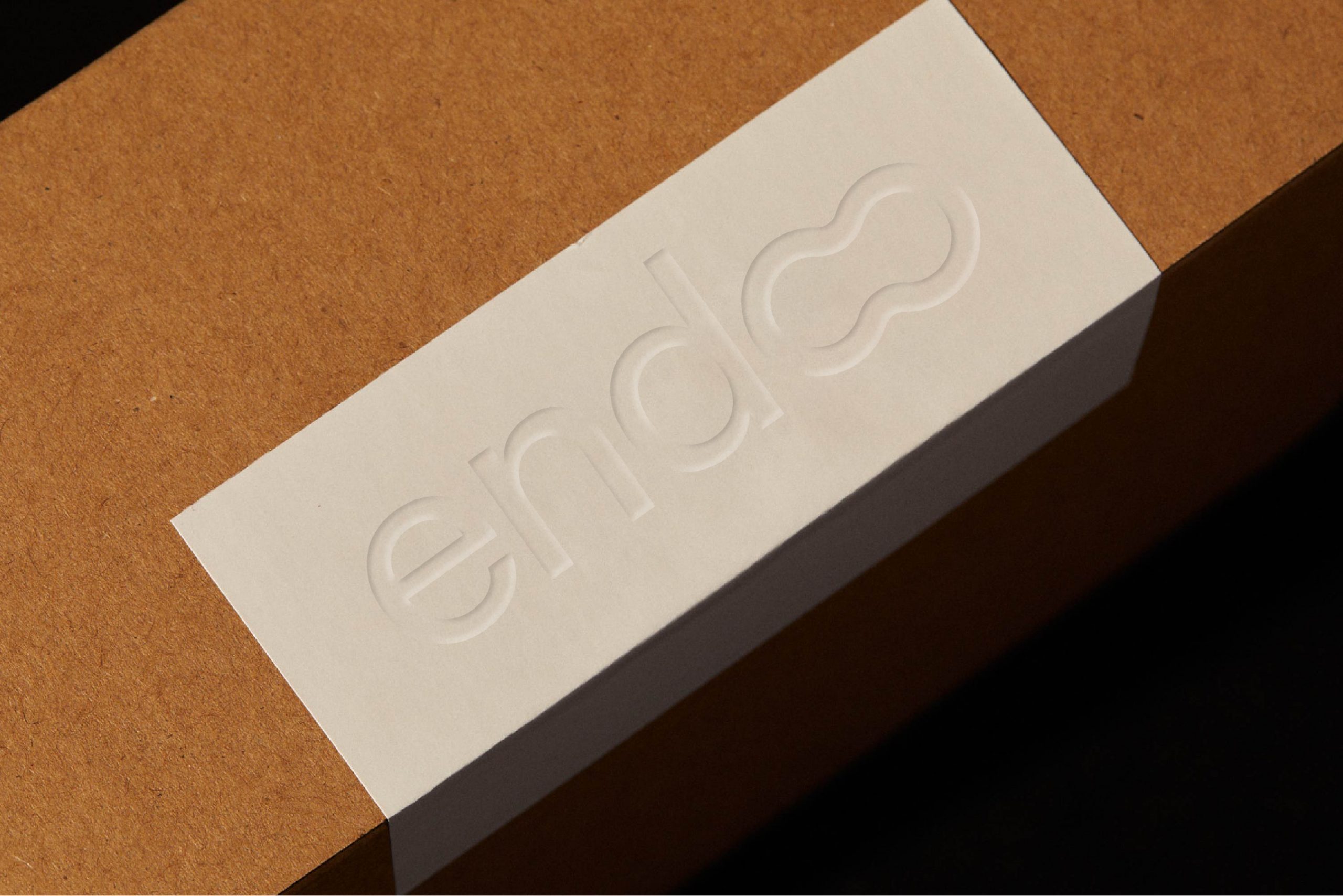
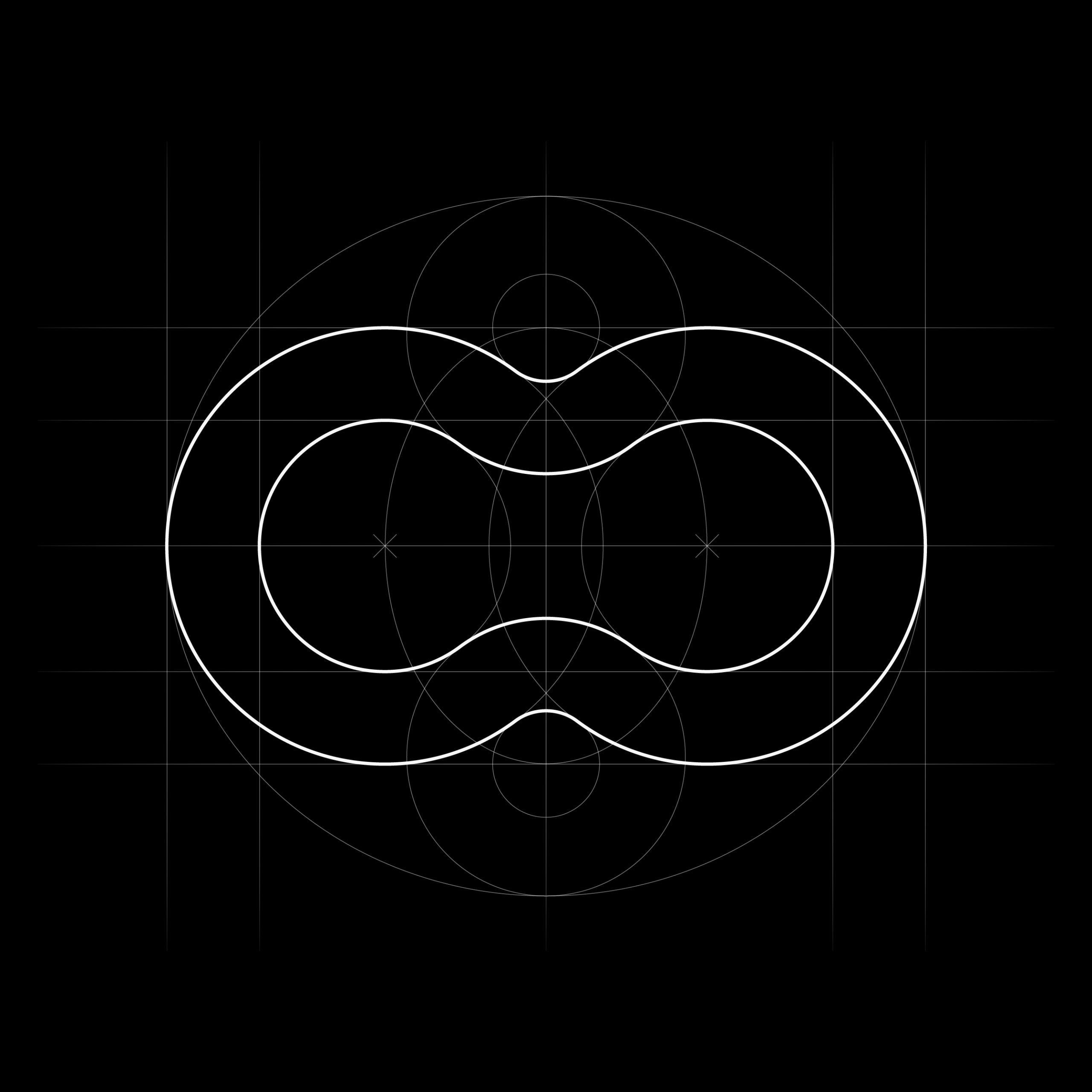
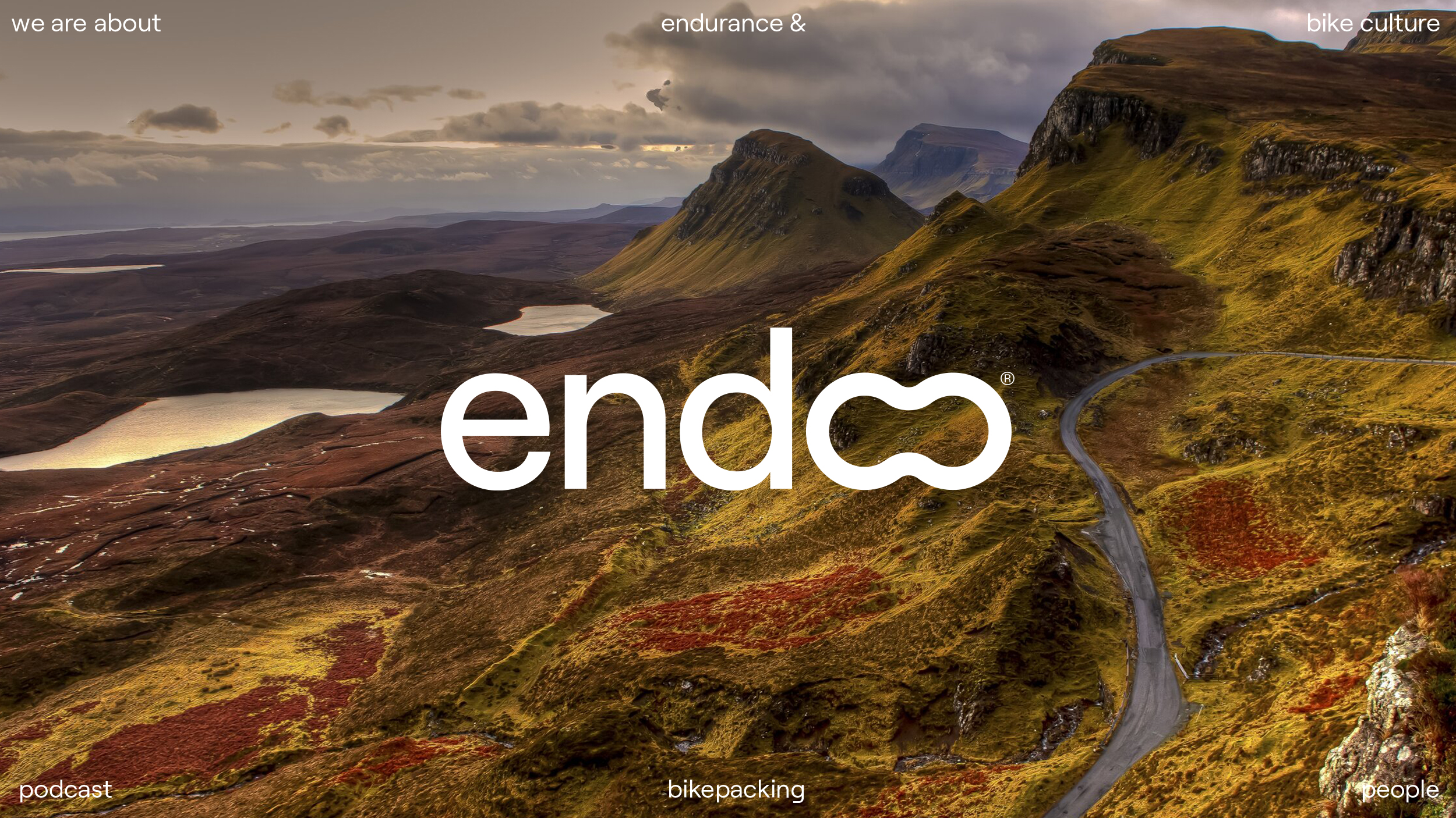
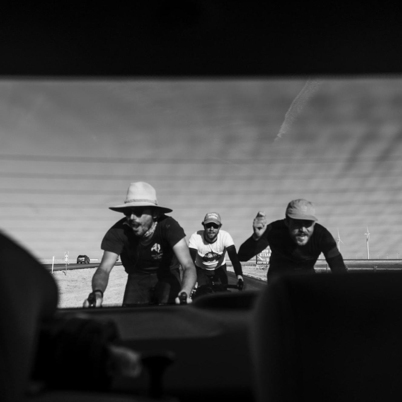
A project focusing on the cycling culture links professional and amateur endurance enthusiasts. The naming idea comes from the abbreviation for the word “endurance”, exploring the double O to create a recognizable symbol that reflects speed, routine, and a simplified chain link.
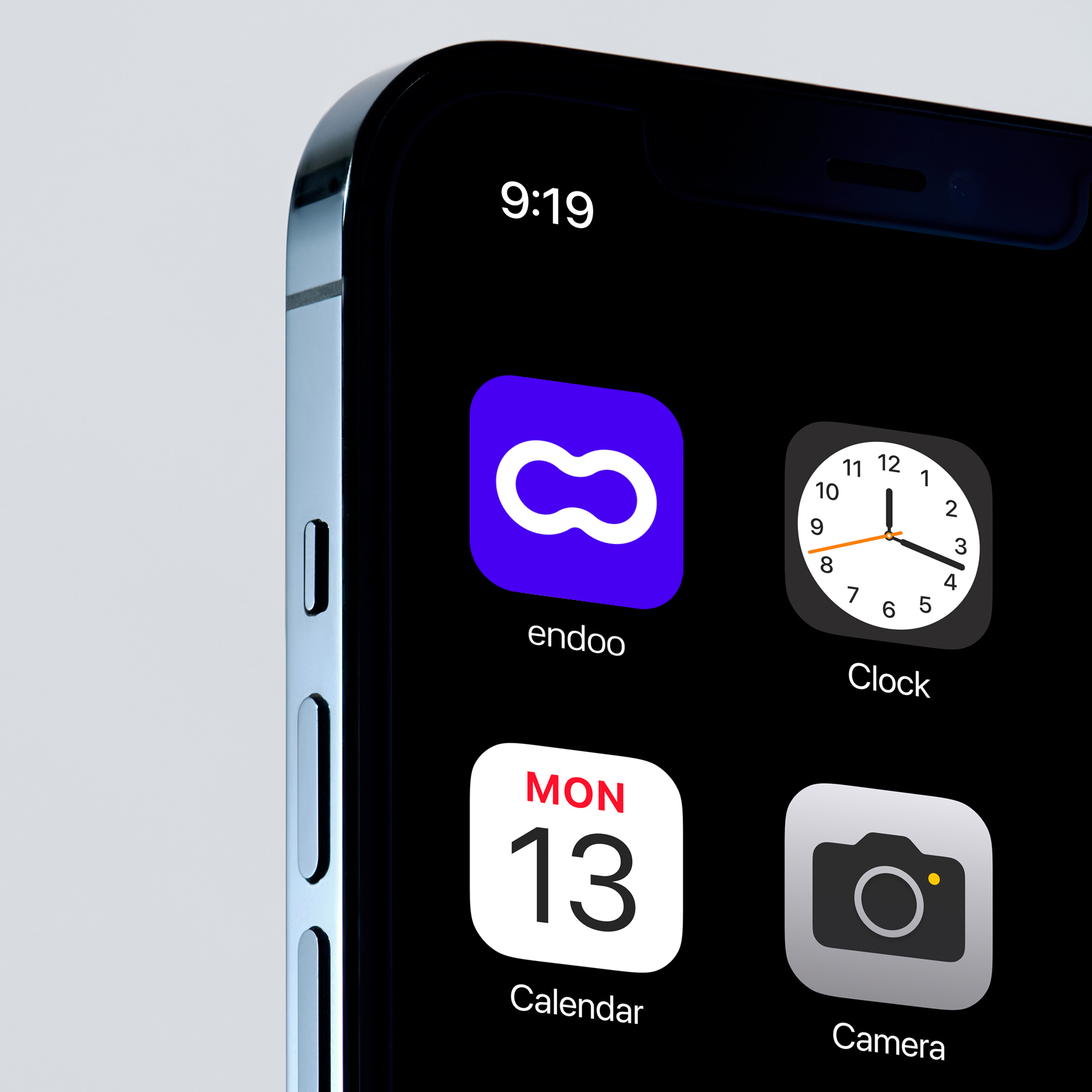
This project is still developing and aims to propagate the long-distance cycling culture in digital platforms such as podcasts, interviews, and printed exclusive materials.